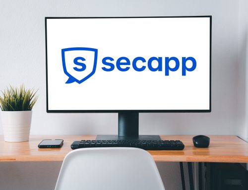
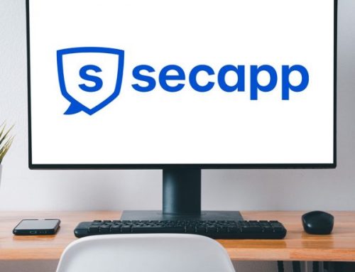
In the summer of 2022, we made a slight facelift to Secapp’s visual appearance. It is part of the brand renewal started in the spring. The aim was to modernize the company’s look and also highlight Secapp’s different usage situations and people in different industries. We also wanted the new look to better support the images associated with Secapp, such as safety and reliability.
However, we didn’t want to abandon the already familiar blue color and logo, we only refreshed both a bit. Secapp’s brand color has always been blue. The new shade of blue is now brighter. We also enriched the brand look with other colors, like orange, which you may notice on our website.
In addition to the new colors, the typography was also modernized to match today’s style and still be easy to read. Secapp’s application still uses the devices’ own system fonts, e.g. for safe operation and accessibility.
![]()
Every second matters

The company’s logo is already familiar among customers and users, so we didn’t want to change the basic shape of the logo. The logo has got its shape from a combination of a shield and a speech bubble, and we wanted to keep it that way, just modernize it a bit. The blue color of the logo was also lightened with the new shade of blue and the new font.
The most visible part of Secapp’s new look is certainly the website, which was renewed during the summer of 2022. We have changed the coloring, unified images and visual style and brought Secapp’s many different usage situations on the website as well. The new look will also over time appear in all Secapp’s channels and materials.
Our product is of course still the same familiar and safe Secapp, which provides security in all situations, when every second matters.
“I am very pleased with our renewed brand. In our website reform, our main goal above all was to increase user-friendliness and make things easy to find. I’m very delighted about all the great feedback from customers, it seems that we have also succeeded in our goal. Many of our own team as well as external experts have participated in renewing the visual look and website. I want to thank everyone for your work and help – this wouldn’t have been possible without you!” – Anna-Mari Blek, marketing manager, Secapp
We are happy to hear feedback about the pages. Any kind of feedback is welcome – positive or negative – so feel free to contact us.
In the summer of 2022, we made a slight facelift to Secapp’s visual appearance. It is part of the brand renewal started in the spring. The aim was to modernize the company’s look and also highlight Secapp’s different usage situations and people in different industries. We also wanted the new look to better support the images associated with Secapp, such as safety and reliability.
However, we didn’t want to abandon the already familiar blue color and logo, we only refreshed both a bit. Secapp’s brand color has always been blue. The new shade of blue is now brighter. We also enriched the brand look with other colors, like orange, which you may notice on our website.
In addition to the new colors, the typography was also modernized to match today’s style and still be easy to read. Secapp’s application still uses the devices’ own system fonts, e.g. for safe operation and accessibility.
![]()
Every second matters
The company’s logo is already familiar among customers and users, so we didn’t want to change the basic shape of the logo. The logo has got its shape from a combination of a shield and a speech bubble, and we wanted to keep it that way, just modernize it a bit. The blue color of the logo was also lightened with the new shade of blue and the new font.
The most visible part of Secapp’s new look is certainly the website, which was renewed during the summer of 2022. We have changed the coloring, unified images and visual style and brought Secapp’s many different usage situations on the website as well. The new look will also over time appear in all Secapp’s channels and materials.
Our product is of course still the same familiar and safe Secapp, which provides security in all situations, when every second matters.
“I am very pleased with our renewed brand. In our website reform, our main goal above all was to increase user-friendliness and make things easy to find. I’m very delighted about all the great feedback from customers, it seems that we have also succeeded in our goal. Many of our own team as well as external experts have participated in renewing the visual look and website. I want to thank everyone for your work and help – this wouldn’t have been possible without you!” – Anna-Mari Blek, marketing manager, Secapp
We are happy to hear feedback about the pages. Any kind of feedback is welcome – positive or negative – so feel free to contact us.